US Department of the Treasury
Responsive Website Redesign
The U.S. Department of the Treasury is the steward of U.S. economic and financial systems, and as an influential participant in the world economy. However, their current website is very content heavy, full of jargon, and popular tools and resources are difficult to access. I worked as a solo UX Researcher and Designer to uncover issues users face and create a responsive website prototype to provide a better user experience through a refined visual design, navigation, and information architecture.
My Role
UX Research
UI Design
Type
Individual Project
Timeline
5 weeks
Tools
Figma, InDesign, Miro, Zoom, Google Drive, Trello
Problem
The U.S. Department of the Treasury provides many resources and useful information for businesses and individuals. However their website is very content heavy, full of jargon, and popular tools and resources are difficult to access making it difficult for the average user to understand information, find what they’re looking for, and get tasks done in a timely manner. Surveys and usability tests uncovered that users often feel lost or frustrated and end up bypassing the website entirely by going to the IRS website or using google to find what they need.
Solution
How might I redesign the website using responsive UI, a new style guide, and graphic design elements to create aesthetic balance, make it more organized, logical, and enjoyable to use?
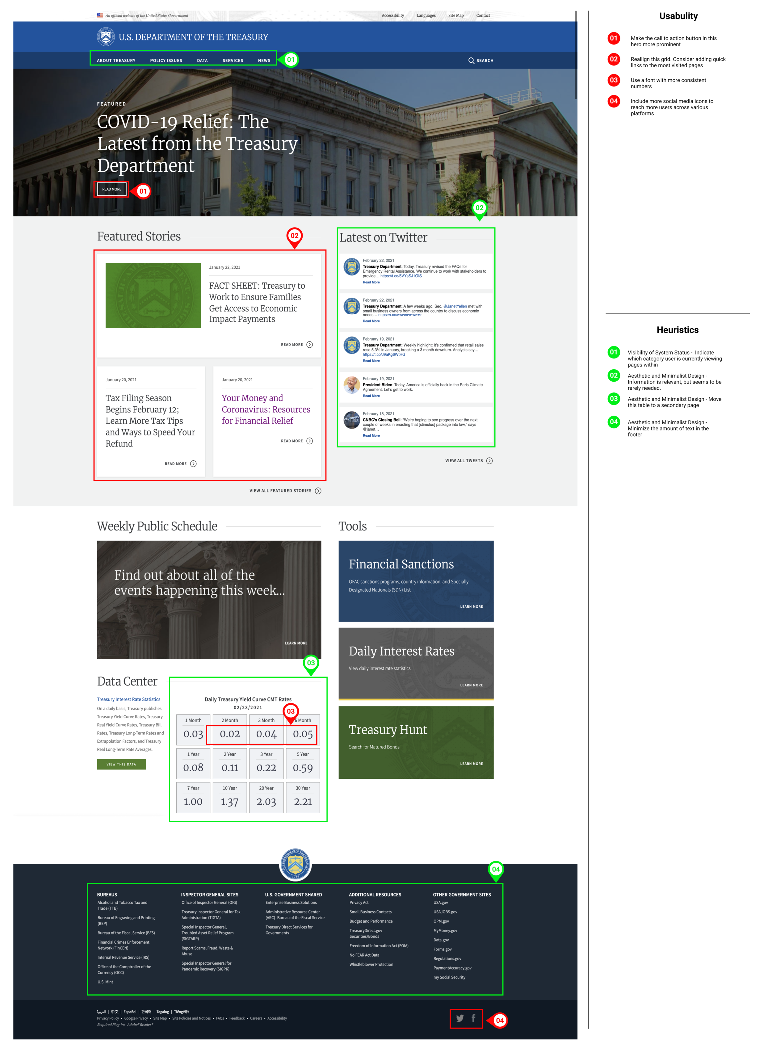
Current US Department of the Treasury Website

User Interface Analysis
I carried out heuristic analysis on the current website to assess its usability and features. I wanted to redesign the Treasury’s website because users find it intimidating and difficult to navigate. It has not been organized in a logical, intuitive way, it offers limited FAQs or “help” resources, and highly sought-after resources are not given priority in the hierarchy of the information architecture. Also, the top navigation and footer menus are bloated and increase the cognitive load for users. A redesign could help make the site more beautiful, functional, and user friendly as well as help present the US Department of Treasury as an authority for government department websites around the world.
Color Accessibility Analysis
I carried out a color accessibility assessment to determine how compliant the site is with WCAG regulations. The site passed the AA level, with the exception of the watermarked seal. Contrast could be increased to make these images more accessible. This assessment helped inform the color palette I chose later to rebrand the website.

Proto-Persona
A proto-persona was created to try and understand the type of user who visits this site and their typical needs and pain points. This process helped me think about what the typical mindset of the users of the website might be and the types of tools or resources they may be looking for when the come to the site.

User Path and Flow
I considered what the typical user path and flow looks like for users like Paul who are seeking tax forms. I also considered the path of a user who might come to the site looking for the status of their COVID-19 stimulus payment. These actions were examined and used later for usability testing.
User Path to Find a W2 Form

Usability Tests
I carried out 4 usability tests with the help of a partner to help me determine how user-friendly the current website is. Participants were asked to check the status of their COVID-19 stimulus payment, and locate a W-2 tax form. Success for these tasks was measured by being able to complete each in under 3 minutes. They scored a 75% and 50% respectively, and users who completed the task fastest used the search bar.
Key Insights
People go directly to the IRS site instead of the treasury
Popular resources should be given prime real estate
There is too much text on every page and menu
It often takes over 3 minutes for users to find what they’re looking for
The navigation menu is too big and the text there is too small

Test Artifacts
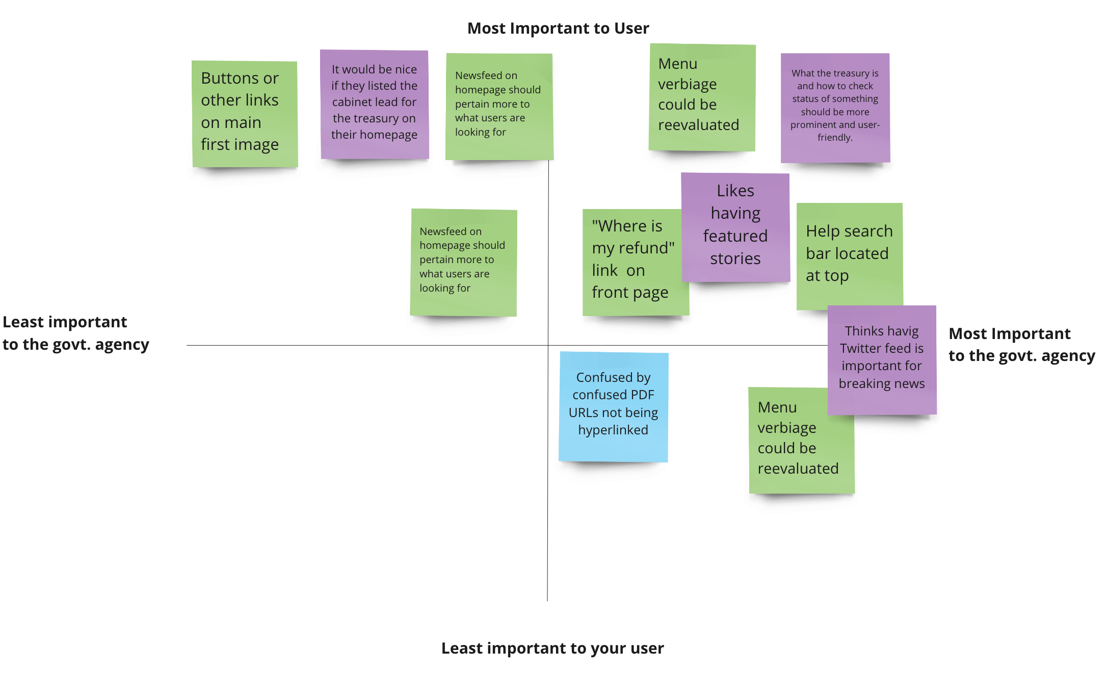
Feedback from user tests were plotted into a prioritization matrix to identify which insights or features were most important to both users, and the agency.

Empathy Map
Insights and quotes from usability testing were used to create an empathy map for Paul. The empathy map helps develop an understanding of what the typical user thinks, says, does, and feels, their pain points, and the opportunities to be gained from a website redesign.
Card Sorting
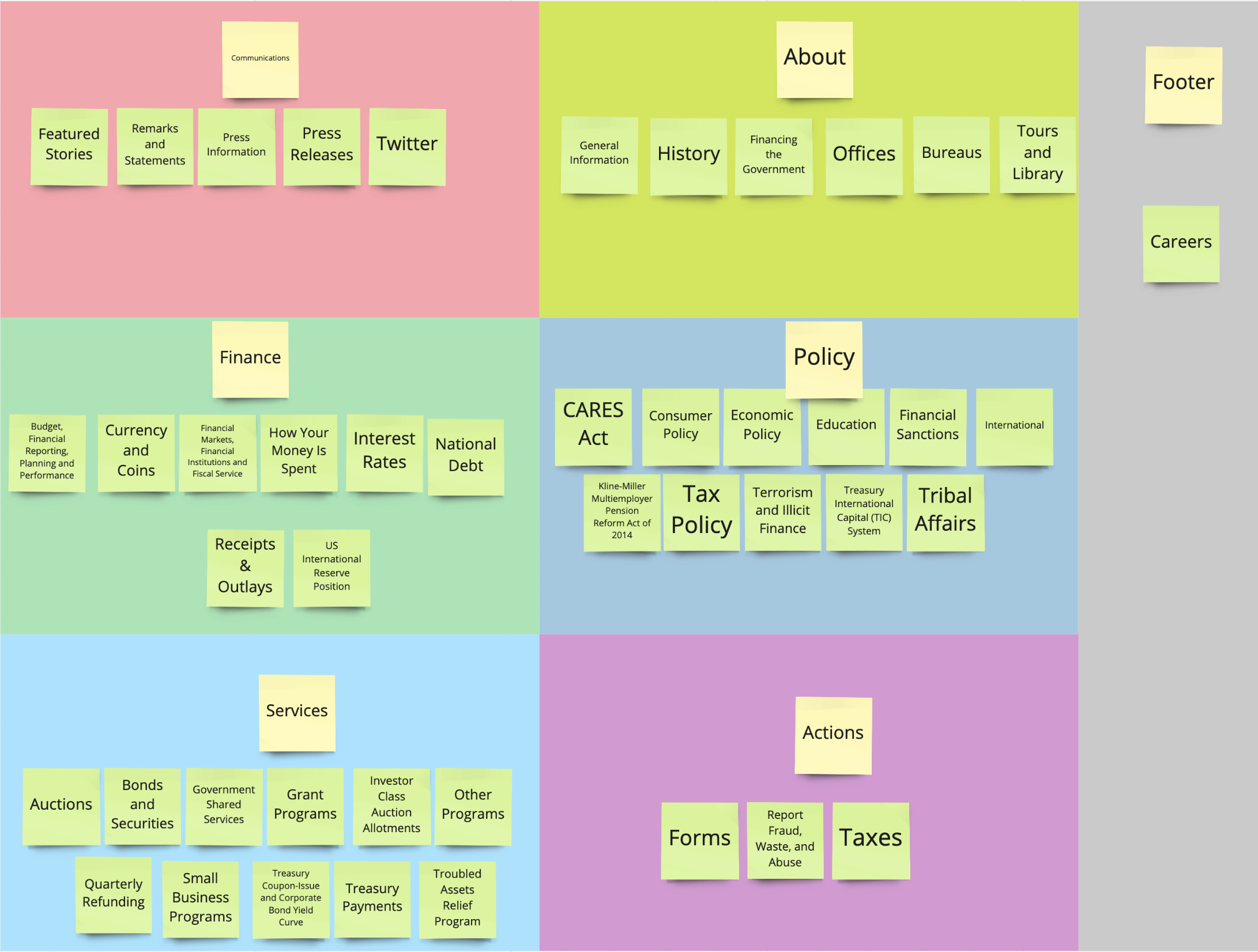
To begin the prototype phase I started with a card sorting activity and gathered feedback about the most logical way to organize the main sections of the website. This helped informed my site map and ensured that resources would show up where user like Paul might expect them to.

Site Map
A site map was created based on the card sorting results. The site map organizes the main navigation sections of the website and allows me to visualize the information architecture before I begin building a wireframe prototype.

Low-Fidelity Wireframe Prototype
I first considered what the navigation menus would look like and how they would function for the site on a desktop and mobile device. Then I built out a wireframe for desktop and mobile.
Mobile Navigation
Desktop Navigation
Desktop Homepage
Clickable Prototype & 5-Second Test
I made my wireframe prototype interactive and conducted two 5-second tests to gauge the impact of my homepage and navigation wireframe design. These tests gave me valuable feedback about changes to make as I iterated into a mid-fidelity prototype including design patterns, components, font size and hierarchy. From these tests I decided to remove stoke lines, minimize some of the shapes, stretch elements across the screen, and make buttons only slightly rounded based on participant feedback.

Mood Board
I gathered inspiration from the web for the typography, color palette, imagery, UI design patterns, and components for the redesigned website. I pulled inspiration from the furniture and decor inside the treasury building, the artistic style on printed money, as well as serif and sans serif font families. I wanted to use a serif font for headers to maintain an official feel, while contrasting with a clean, modern, and minimal sans-serif font for body text.

Homepage Mid-Fidelity Mockup
The style guide was applied to the homepage to create a mid-fidelity, clickable prototype. At this stage I wanted to make sure the homepage successfully explained what the Treasury is, their main functions, and what resources are available on the website.
The current website anchors itself in dark blues which cary a lot of visual weight. I decided to contrast this with lighter hues and to maximize white space in order to bring a sense of lightness to the redesign. I also chose to utilize graphic elements to balance the content-heavy homepage to make it more digestible.
User Tests
I then carried out four user tests to gauge if my redesigned homepage and navigation was successful at making it clear what the Treasury is and helped participants find relevant resources faster. I also asked them if the organization made sense and received additional design feedback for my final prototype iteration. The result of these tests were that my redesigned website was successful at solving many of the design and organization issues that are faced with the current website.
Final High-Fidelity Prototype

Conclusions & Takeaways
Even with quality designs, government websites need help making popular content, resources and tools accessible. Shortly after completing this project the US Treasury posted a position for User Experience Design.
Navigation menus on mobile devices should take up the entire width of the screen, if not the entire page.
White space and graphic design elements can help balance web pages that are content-heavy.
I can save time in the future by making responsive buttons and links on a homepage first, then duplicating and editing that frame for other pages.
Minimal footers are functional, beautiful, and spark joy in other designers.
I really enjoy the process of creating branding style guides.
It’s important to differentiate content that is repeated on multiple pages so users aren’t confused about which page they’re currently viewing.
It’s important to arrange lines of text so that single words are not on a line by themselves. This is easily achieved in prototypes, but are often unavoidable on responsive pages.


